
Walk down any wine aisle and watch people shop. Most don’t read detailed descriptions or compare vintage charts – they scan shelves visually, pause at certain bottles, and make split-second decisions based largely on what catches their eye. This process happens so quickly that shoppers often don’t realize how much the bottle itself influences their choice.
The wine industry has spent decades studying these buying patterns, and the results reveal just how powerful packaging psychology can be. From bottle shape to color to weight, every design element sends subconscious signals about quality, price point, and brand positioning that can make or break a sale.
Table of Contents
The Shape Factor That Drives Instant Decisions
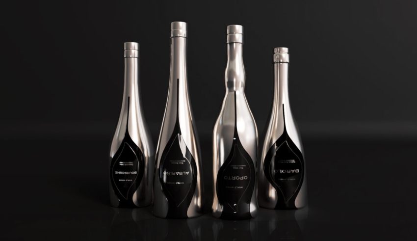
Bottle silhouettes communicate different messages before consumers even read a single word on the label. Traditional Bordeaux bottles with their tall, straight sides and pronounced shoulders suggest formality and premium quality. Burgundy bottles with their sloped shoulders and wider bodies often signal approachability and food-friendliness.
Here’s where it gets interesting – these associations aren’t arbitrary. They’ve been reinforced by decades of marketing and consumer experience with wines from these regions. When a new world winery chooses a Bordeaux-style bottle for their Cabernet Sauvignon, they’re borrowing from this established visual vocabulary to communicate seriousness and quality.
Producers sourcing glass wine bottles for sale often face this decision early in their branding process, since bottle shape becomes part of their visual identity. The choice affects everything from shelf presence to perceived value, making it far more strategic than purely aesthetic.
German-style bottles with their tall, slender profiles suggest elegance and tradition, particularly for white wines. But use that same shape for a bold red wine, and consumers might unconsciously question whether the wine matches their expectations. The disconnect between bottle shape and wine style can create hesitation at the point of purchase.
Color Psychology in the Wine Aisle
Glass color affects consumer perception in ways most people don’t consciously recognize. Dark green bottles are associated with premium quality and tradition, partly because prestigious wine regions have used them for centuries. They also provide practical UV protection, creating a subconscious link between dark glass and wine preservation.
Clear glass creates completely different associations. It suggests freshness and modernity, making it popular for wines positioned as approachable and contemporary. But clear bottles also expose the wine to light, which can be problematic for long-term quality – a trade-off between marketing appeal and product preservation.
Amber and antique green bottles occupy middle ground, offering some UV protection while maintaining visual warmth. These colors often appeal to consumers looking for something between ultra-premium and everyday casual, fitting wines positioned in the mid-market segment.
The problem is that color associations can vary by market and demographic. Younger consumers might associate clear bottles with innovation and transparency, while older wine buyers could interpret the same clear glass as indicating lower quality or lack of tradition.
The Weight and Feel Psychology
Bottle weight creates powerful quality perceptions that happen entirely through touch. Heavier bottles feel more premium, even when the wine inside is identical to what’s in a lighter container. This tactile feedback reinforces visual cues about quality and value.
But here’s the catch – heavier bottles cost more to produce and ship, directly impacting profit margins. Wineries must balance the psychological benefits of substantial glass against the practical realities of cost control and environmental impact. Some producers have found success with bottles that feel substantial without excessive weight, achieving the psychological benefit more efficiently.
The tactile experience extends beyond weight to surface texture and bottle proportions. Bottles with subtle embossing or unique textures create memorable physical interactions that can influence repeat purchases. When consumers remember how a bottle felt in their hands, they’re more likely to seek it out again.
Visual Elements That Drive Purchase Decisions
Beyond the bottle itself, the interaction between glass and label creates the total visual package. Light-colored labels on dark bottles create high contrast that draws attention from across the aisle. Dark labels on clear bottles can appear to float within the glass, creating visual intrigue.
Label placement and proportion relative to the bottle shape affects perceived quality. Labels that seem perfectly sized and positioned suggest attention to detail and premium positioning. Labels that appear too large, too small, or misaligned can undermine quality perceptions regardless of the wine’s actual quality.
The neck of the bottle offers another psychological touchpoint. Foil capsules, wax seals, or decorative closures all communicate different messages. Traditional foil suggests established quality, while wax seals imply artisanal craftsmanship. The absence of any neck decoration can appear either cleanly modern or disappointingly basic, depending on the overall brand positioning.
Market Segment Psychology
Different price segments require different psychological approaches through bottle design. Ultra-premium wines often use traditional shapes and dark colors to suggest heritage and established quality. These bottles tend to be heavier and more substantial, reinforcing the premium positioning through tactile experience.
Mid-market wines face a more complex challenge – they need to suggest quality without appearing pretentious, and approachability without seeming cheap. This often leads to contemporary takes on traditional shapes, or familiar silhouettes in unexpected colors that balance innovation with recognition.
Value wines typically focus on clear communication and broad appeal rather than premium cues. Lighter bottles, clearer glass, and straightforward designs can actually work better in this segment because they align with consumer expectations about price and accessibility.
The Shelf Psychology Factor
Retail environment psychology plays a huge role in bottle design effectiveness. Bottles need to stand out in crowded displays while fitting naturally among their price-point peers. Too different, and they might seem out of place. Too similar, and they disappear entirely.
Height variations can be strategic – slightly taller bottles gain visibility advantage, while unusually short bottles might get lost. Width affects how many bottles fit per shelf facing, impacting retail relationships and display prominence.
Color blocking happens naturally as consumers scan shelves, so bottle color affects whether wines get grouped visually with premium or value segments. A clear bottle might get lumped visually with other clear bottles regardless of price, while a dark bottle joins the premium cluster in consumers’ mental categorization.
The psychology of wine bottle design operates largely below conscious awareness, but its impact on purchasing decisions is measurable and significant. Understanding these psychological triggers helps winemakers make packaging choices that support their brand positioning and connect effectively with target consumers. The most successful wines align their bottle design with both their quality story and their market positioning, creating packaging that reinforces the brand message at every touchpoint.


